


Exploring the foundations of high-quality design
Defining quality in design: key principles and insights.

One of the questions that often sparks diverse responses within the realm of design is, “What defines a high-quality design?”. It's undoubtedly an open-ended query that invites a multitude of answers, each unique in its own way, neither good nor bad, just different.
That's the reason why I frequently ask it to job candidates during interviews; I firmly believe it reveals the designer's mindset, thinking, and principles. When the point of view of the respondent resonates with that of the inquirer, an immediate connection is established. And whenever I discuss this topic, I like to explore the conceptual aspects because it is where the most enriching debates and conversations arise.
I consider myself lucky due to the curriculum of my dual degree in graphic and digital design, which I completed several years ago. I had the wonderful opportunity to delve into timeless subjects like design history, art history, artistic drawing, sociology, programming, and photography, among numerous others.
The experience led me to firmly believe that these subjects are essential in the training of a designer. Notably, a relatively recent statement by Tobias van Schneider, in his article titled “Dear young designer”, had a significant impact on the community and resonated with my perspective.
❝ If you want to be a better designer, don’t study design books. Study sculpture. Study paintings. Study cars, watches, philosophers, movies, fiction, music, people. Study the world. ❞
— Tobias van Schneider
I want to clarify that I'm not suggesting that one cannot become a proficient designer through practical or self-taught methods, and it's important to emphasize that this doesn't necessarily require following traditional academic routes. Regardless of the path chosen, taking the time to study, reflect upon, and understand the nuances of the artistic process and creative thinking provides designers with invaluable knowledge crucial for executing and articulating design concepts and decisions.
Immersing in creative processes and techniques from various disciplines, while also training the eye and mind to explore diverse solutions, approaches, and aesthetics, broadens the problem-solving perspective and encourages more open-minded reasoning. However, let's get back to the central focus of this post, which is quality.
As I mentioned, quality in design takes into account plenty of factors like user needs, usability, aesthetics, viability, feasibility, and performance. It entails the integration of numerous design principles and continuous refinement to craft a product that not only meets rigorous standards of excellence, but also provides an exceptional experience.
Creating a magic formula is challenging, but there are some specific areas that one can focus on to meet the desired standards. It is crucial to integrate these specific attributes and apply best practices in each one, so let's delve into the key elements that set the foundation of quality:
Simplicity: Present elements in a way that are simple and easy-to-understand. The human mind has limited attention, then aim to reducing as much as possible the cognitive load and interaction cost. So that the user doesn't have to think, the designer must have already done it thoroughly in advance, often from multiple perspectives.
Coherence: Make sure that the visual design is unambiguous, coherent, in harmony with its patterns, and aligned with the brand's values and identity.
Consistency: Keep consistency across different contexts, ensuring predictability and allowing users to anticipate what will happen next. Features and functions should align with users' requirements and needs, and operate as intended.
Usability: Make it simple to operate and comprehend. Interfaces must be intuitive, user-friendly, and accessible to a wide range of users. Usability is key since it has an effect on several commonly used metrics in digital product evaluation, such as SUS (System Usability Scale), CES (Customer Effort Score), NPS (Net Promoter Score), Task Success Rate, Time on Task (ToT), or, at Mews, UD (User Disengagement).
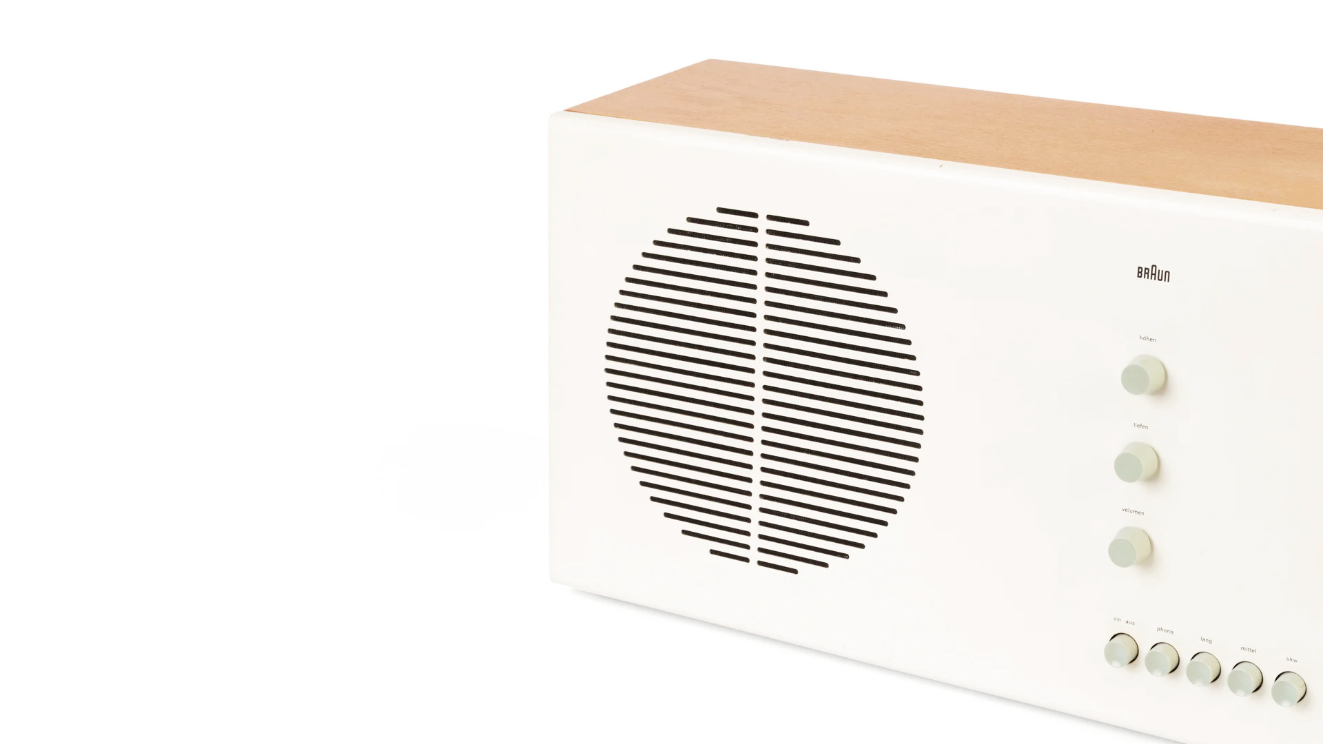
Aesthetics: The experience must have a pleasing and appropriate design. Always keep in mind the Aesthetic-Usability Effect, which highlights the connection between a product's visual appeal and its perceived usability, stating that visually pleasing interfaces tend to make users more forgiving of minor usability issues. By prioritizing aesthetics, we can design solutions that not only function smoothly but also leave a lasting impression, fostering a deeper connection between users and the products they interact with.
Attention to detail: Paying attention to details makes the difference. The little things —words, micro-interactions, textures, movements, and materials—, those moments that make some designs truly special and loved by their users. High-quality designs always involve meticulous work on elements like spacing, alignment, typography, motion, and content, which collectively contribute to a better perception and connection with the user.
Emotional impact: Design has the power to evoke emotions like joy, empathy, and excitement. In this way, hold user's attention on a deeper, more emotional level.
Timelessness: Try to avoid trends, I know it can be challenging. While trends might have a place in certain short-term or ephemeral projects, truly exceptional designs typically possess a timeless quality that allows them to remain relevant and impactful for years. They set the trend rather than following it, with their style defined by the project itself, instead of trying to fit the solution into a specific pattern.
Guidance and accuracy: Offer suitable controls, guiding the user’s attention towards the main actions. The interface must be devoid of mistakes and supply precise information.
Awareness and location: Notify users promptly and responsively about the status of the interface and the outcomes of their actions. Guarantee that navigation is user-friendly and effortless, enabling users to locate what they need quickly and without difficulty.
❝ Make everything as simple as possible, but not simpler. ❞
— Albert Einstein
By paying attention and addressing these aspects meticulously, I can guarantee that the quality of designs will see improvement. While artistic talent certainly contributes to this excellence, especially when it comes to aesthetics, it should not become a blocker nor generate excessive concern since other skills such as creativity and originality can be nurtured and developed. It's a matter of patience, unwavering consistency, and having faith in the creative process.
When I reflect on this topic, it invariably brings to mind an analogy from the world of sports performance, particularly cycling. Throughout my years of practicing triathlon and cycling, one concept has consistently stood out: the aggregation of marginal gains.
In athletics, every athlete eventually reaches a point in their development where making significant performance improvements becomes exceptionally challenging. This is when the pursuit of numerous small enhancements becomes priceless. By consistently achieving 1% improvements in multiple areas, one can ultimately get substantial overall gains.
This principle without doubt extends to the field of design. When undertaking design projects, it's crucial to adopt the habit of seeking and implementing marginal gains wherever possible.
This entails a meticulous focus on details, an emphasis on simplicity, ensuring a seamless flow, and maintaining overall consistency. As well as the usage of consistent patterns to let the users understand what to expect and effectively guide them through designs that not only possess aesthetic appeal, but also genuinely meet their needs.
✦
This way, you will progressively meet the quality standards you're aiming for.